Revamping Spixler's Sports Betting Websites
Background.
Spixler AB is a Swedish-American company that specializes in creating sports betting and gaming affiliate websites. They approached the Fastdev team to update the design and improve the performance of some of their websites such as ats.io and sqore.com. They’re pros when it comes to writing content and doing SEO, but they needed our expertise to take their websites to the next level.
Challenges.
The website used to be speedy, but after adding some new bells and whistles, it slowed way down. Some pages took more than a minute to load, which was terrible.
The primary challenge was to improve the website’s page speed and “Time to interact” metric. We were faced with a sports betting website revamp. We had to make the pages load faster without increasing the bounce rate. The website used to be speedy, but after adding some new bells and whistles, it slowed way down. Some pages took more than a minute to load, which was terrible. We tried optimising the front-end by caching page content, optimising API requests, but it only got us so far — a score of 80 up from 60 before. So, we built a “Smart proxy” that not only cached pages for quicker access, but also analysed the most popular pages and cached them for even shorter periods of time.

Results.
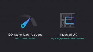
The results were amazing! The website became super fast, even faster than it was before the changes, up-to 13x faster! eg 27 seconds to 2!!
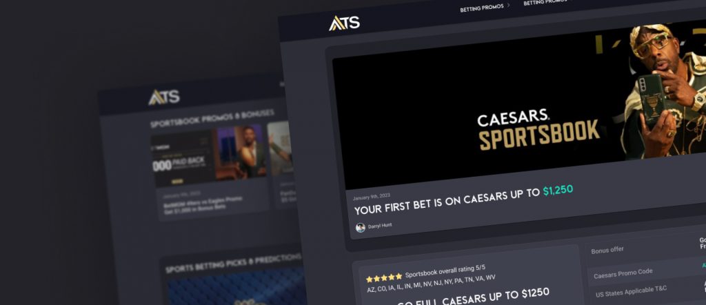
The results were amazing! The website became super fast, even faster than it was before the changes. All pages were available to users in one second or less. After we optimised the performance, we went ahead and redesigned ats.io. The website looked really old-fashioned compared to the competition. The competition were killing it with their modern designs and easy-to-find content.
We gave ats.io a complete facelift, with a new logo, colors, and a fresh layout. We made sure to take into account their existing look and all the smart SEO. However, we had to make changes gradually because search engines can be really sensitive. As the website was built on WordPress, we had to use two themes at once, one for the current style and one for the new template.
The redesign process for ats.io is still ongoing, but the team has made significant progress in updating the site’s look and feel. The new design is more modern, and the user experience has improved significantly. The team used two themes simultaneously, allowing them to support the current style while also adding new pages with the new template.


